
© Unknown
Data from the Office for National Statistics show that the proportion of total deaths in England among unvaccinated people dropped sharply in early 2022, even as excess deaths soared. The proportion then remained low throughout the following two years, indicating that the additional deaths during this period were concentrated in the vaccinated.
Is this why the authorities continue to resist releasing the full data on deaths by vaccination status? A cross-party group of 21 MPs and peers are the latest to write to request the data be released. Are the authorities refusing because they know the data show excess deaths predominantly in the vaccinated?
The striking effect was seen in every age group. The charts showing these results can be seen below (find the data here, table 5). The blue lines show the total deaths by month in the age group (left-hand axis) while the red lines show the proportion of deaths in the unvaccinated in the age group (right-hand axis; unvaccinated here means receiving no doses). The most striking feature on each chart is the steep drop in the red line in early 2022, which denotes a sharp and sustained drop in the proportion of deaths in the unvaccinated and a corresponding rise in the proportion in the vaccinated.
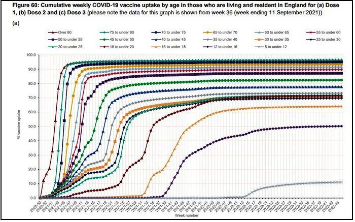
Note this is not because more people got vaccinated at that time, as the number getting their first dose in these age groups was almost zero by this point (see chart below, taken from here, data here). People getting their first dose may affect the trends seen in 2021, particularly in the first part of the year, though the over-60s were largely done with first doses by June 2021.
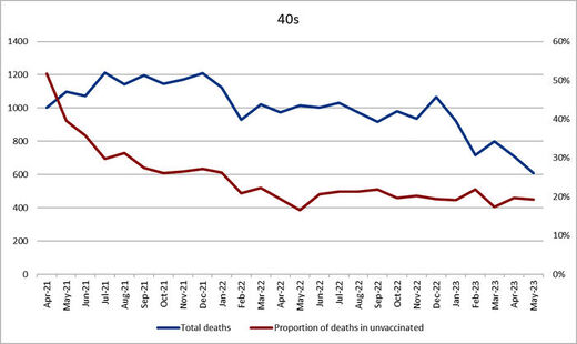
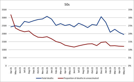
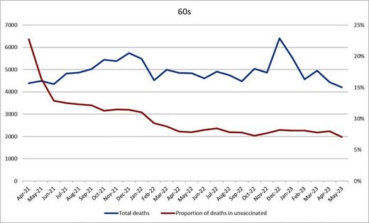
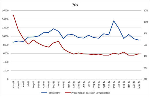
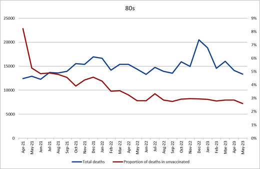
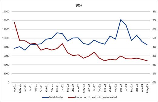
These charts include no comparison with death rates before the vaccination period so don't allow us to say very much about the pre-Omicron period as there is little to compare it to. However, there are notable spikes in the red lines for those over 70 during the Delta wave of late 2021. On first sight this would seem to indicate vaccine efficacy against the Delta variant during that winter. Things may not be so straightforward, however. Notice that the other largish spike for those over 80 is in summer 2022. Importantly, this was not associated with a Covid wave; instead it was associated with a heatwave - that was when the heat dome was sitting over Europe causing record temperatures. This is significant because the vaccine obviously does not protect against heatwaves. This means the reason for the summer 2022 spike is not vaccine efficacy. What is it then?
It seems likely it is related to the 'healthy vaccine effect' i.e., the fact that people who take vaccines tend to be people with better background health outcomes than those who don't take vaccines. A number of studies indicate that vaccinated people have a background death rate around half that of unvaccinated people (this is a background death rate not related to vaccine efficacy or safety).
The poorer background health of the unvaccinated group means that any general cause of death that disproportionately affects the frail or those with comorbidities, such as a virus epidemic or a heatwave, will naturally, other things being equal, disproportionately affect the unvaccinated group, for reasons unrelated to the vaccine. This would explain the summer 2022 spike in the red lines and it may also explain some or much of the spike during the Delta wave as well. Assuming this is right, it makes the lack of spikes during other waves, such as winter 2022-23, even more striking, as one would normally expect the unvaccinated group to be disproportionately affected by a virus wave or a winter, yet instead the lines remain flat. These flat red lines during waves of deaths are therefore also potentially indicative of a concentration of excess deaths in the vaccinated.
The headline finding from these charts is the striking concentration of excess deaths in the vaccinated after early 2022, just as Omicron appeared. This worrying observation may be why the authorities are keeping the full data, which would confirm or rule out such a finding, firmly under wraps.
Source link

