Obama Roasted After LITERAL “Headache Inducing” Addition to Presidential Center
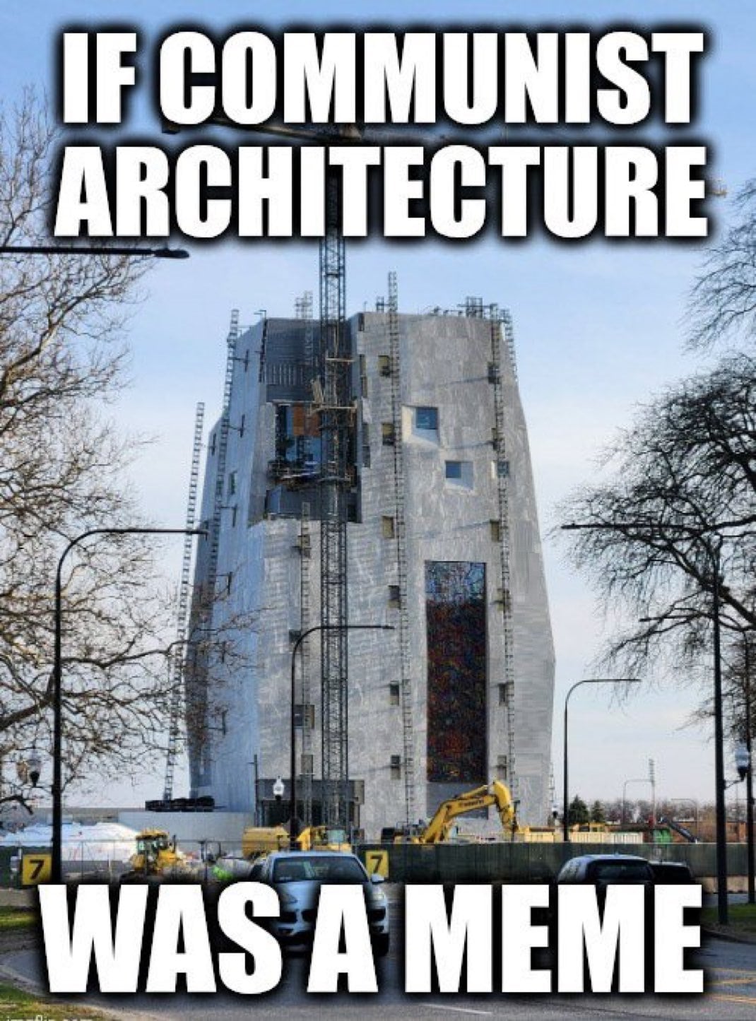
You have to wonder if Obama regrets every decision leading up to the monstrosity that bears his name on Chicago’s south side.
I’m talking of course about the infamously ugly Barack Obama Presidential Center.
Then again, Obama’s commitment to maintaining a narrative in spite of reality is well documented.
But a NEW ADDITION to the towering monolith-like building has raised the bar.
Not only is it hard on the eyes, but it is causing cranial pain!
Maybe Obama believes his own propaganda; maybe he truly thinks the Obama Presidential Center actually looks… nice?
But if he has fooled himself, he hasn’t fooled the internet.
And the most recent addition didn’t just reignite the longtime critics because the structure lacks aesthetically pleasing qualities (it’s ugly…) — but it is now LITERALLY giving people headaches!
Honestly, I thought the building itself was already more than sufficient for bringing on a stress headache or migraine:
As one X user described it…
It doesn’t exactly conjure up warm, fuzzy feelings:
It's like a Klingon prison.
— MrGarbage (@GarbageDudes) February 17, 2026
So how do you make an ugly building even uglier???
Maybe if you add a few tightly spaced WORDS on the outside of the building, in a font that makes you want to claw your eyes out?
And that’s exactly what they did. Here’s a close-in view of the addition as shared on X:
I's indistinguishable from L's and T's. E's indistinguishable from F's. Multiple words get disjointed--not just on one plane but two.
— Jacob Shell (@JacobAShell) February 17, 2026
Truly, one of the most headache-inducing reading experiences I've ever had. pic.twitter.com/hohr6Whusy
Before you strain your brain and your eyes trying to decipher that script, keep in mind that many others have already fallen prey:
I gave up after developing a headache three lines from the top.
— Watching the Show (@S_entialFreedom) February 17, 2026
And to my dyslexic folks… please be particularly forewarned:
The dyslexic in me is not amused
— ZitoSalena (@ZitoSalena) February 17, 2026
Obama is now enduring a fresh round of heat from the internet over his unmitigated ability to make a bad thing far, far worse.
The lettering was taken directly from a civil rights speech Obama gave in 2015.
But the STYLE of the lettering is what has stirred up most of the fuss, keeping with an outdated “Brutalist-style” of design — as highlighted in this report from Fox News:
Former President Barack Obama’s presidential center in Chicago is again coming under scrutiny for its architectural design — this time leaving locals scratching their heads over confusing text wrapped around the top of the building.
“I’m outside the Obama Center museum tower right now,” Chicago Sun-Times architecture critic Lee Bay posted to X Monday, sparking a deluge of mockery from locals and conservatives.
“The new letters – an excerpt from Obama’s Selma speech – are tough to read to me, giving off the lorem ipsum vibes,” he added, referring to placeholder “dummy” text frequently used in graphic design templates to fill space with scrambled Latin.
The construction includes a 225-foot museum tower with the text of Obama’s 2015 speech in Selma, Alabama, marking the 50th anniversary of Bloody Sunday, when civil rights demonstrators were met with violent resistance from local law enforcement in a watershed moment that helped galvanize support for the 1965 Voting Rights Act.
The campus has come under scrutiny from locals over gentrification concerns and over its Brutalist-style of architecture, a post-war-era style popularized in the 1950s known for its modular and minimalist designs. For locals in Chicago, they’ve dubbed the building the “The Obamalisk,” according to the New York Post, in a jab at the Brutalist-inspired design.
Here’s a look at the actual text, hopefully easier to read, which is now emblazoned on Obama’s Presidential Center.
This comes directly from a screenshot from Obama’s own website:
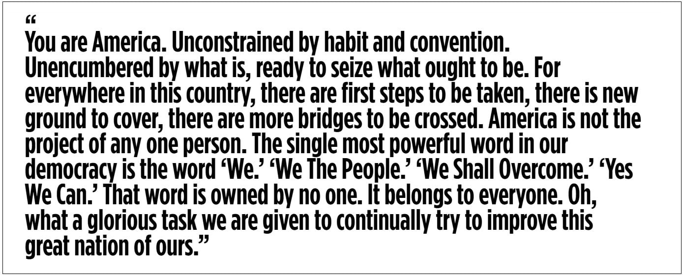
And here’s the full text of the enormous lettering in case that’s still hard to make out, taken from the same website:
“You are America. Unconstrained by habit and convention. Unencumbered by what is, ready to seize what ought to be. For everywhere in this country, there are first steps to be taken, there is new ground to cover, there are more bridges to be crossed. America is not the project of any one person. The single most powerful word in our democracy is the word ‘We.’ ‘We The People.’ ‘We Shall Overcome.’ ‘Yes We Can.’ That word is owned by no one. It belongs to everyone. Oh, what a glorious task we are given to continually try to improve this great nation of ours.”
But here, here! I alluded to a social media firestorm erupting anew in Barack Obama’s direction.
A firestorm, indeed, it has become.
And some of the responses online have been absolutely hilarious and witty.
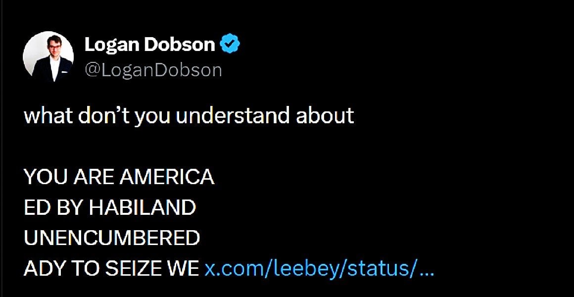
I’ll start with one of my favorites:
what don’t you understand about
— Logan Dobson (@LoganDobson) February 16, 2026
YOU ARE AMERICA
ED BY HABILAND
UNENCUMBERED
ADY TO SEIZE WE https://t.co/kmHawlABHO
I’m adding a screenshot of that one in particular…
Just in case something shady happens to the original post:
Then there are the classic ‘internet-bro’ interpretations of the message the architect was trying to convey:
Obama's new library.
— G (@stevensongs) February 18, 2026
Alexa, zoom in and enhance. pic.twitter.com/714wgJYEix
I won’t give that one away, except to drop a single hint: has your car warranty expired???
I never did quite trust Alexa, so I have a feeling that rendering isn’t as accurate as some of the others.
Like this one, that went for a TRUTH IN ADVERTISING approach, suggesting a completely different set of words that SHOULD be emblazoned on the side of Obama’s signature landmark:
This is what the text should read... pic.twitter.com/YaZ2iSJQuY
— The OverboostedOne (@OverboostedOne) February 18, 2026
Now that’s more like it.
Though… if we put it to a vote, I might have to throw my hat in with the suggested lettering put forth by this X account:
The Obama presidential library is more beautiful than we expected... pic.twitter.com/9hjEuYIv8c
— ForAmerica (@ForAmerica) February 18, 2026
Once you get past the lettering, you can’t help but notice the visually shocking lack of windows.
Which only amplifies the drab ugliness of the building.
Apparently, that’s a utilitarian design feature meant to protect the decor intended for the interior of the main structure.
I guess, maybe… points for not making it ugly on PURPOSE? (Maybe I’m being too generous.)
That was according to an Obama Foundation official quoted alongside longtime Obama ally Valerie Jarrett recently in regards to the Center’s design and appearance, as reported by the New York Post:
“They somehow managed to make the Obama presidential library even uglier,” conservative influencer Johnny Maga said bluntly. “My gosh.”
The building’s austere look has previously drawn comparisons to the “Death Star” and a “concrete tomb,” but an Obama Foundation official explained in December that the design was meant to evoke unity, not Darth Vader.
“The shape of the building was actually meant to mimic four hands coming together to show the importance of our collective action,” Obama Foundation deputy director Kim Patterson told CBS Chicago.
The 225-foot tower’s windows are few and far between, which Patterson noted was also purposeful.
“There are not a lot of windows on the building, but that’s intentional because sunlight is just not a friend to the artwork and the artifacts that are going inside of the building,” she said.
Obama Foundation CEO Valerie Jarrett, who served as a senior adviser during the former president’s two terms in the White House, noted that Obama has been very involved in the design of his library.
“I wish that people could be a fly on the wall to see how many times in the course of the day that I hear from President Obama about ideas for the center, tweaks, programming, what we can do for the design,” Jarrett said.
Obama’s sprawling 20-acre presidential center is expected to open next June in Jackson Park, on the South Side of Chicago.
I could literally go on and on about how ugly that place is.
How much money it has cost. (It’s creeping up on a BILLION dollars at this point!)
But I want to close this story out with something that really raised my hackles in relation to his Presidential Center — because I’m betting our readers will have the exact same response.
Check out this clip shared on X a few days ago by Benny Johnson.
This was taken from a podcast interview Obama gave recently in which he reveals one of the intended uses of his Presidential Center.
Watch this:
Barack Obama says his hideous Presidential Library will be used to Create “Activists” and refers to it as a “Social Change University”
— Benny Johnson (@bennyjohnson) February 14, 2026
“The Presidential Center is will constantly refresh and renew as sort of a Social Change University… What that does is it's building a… pic.twitter.com/n9yHfx226C
Here’s the full screen version of that video for easier viewing…
And I’ll drop the full quote from Benny Johnson’s post down below as well:
And here’s that full quote:
Barack Obama says his hideous Presidential Library will be used to Create “Activists” and refers to it as a “Social Change University”
“The Presidential Center is will constantly refresh and renew as sort of a Social Change University… What that does is it’s building a community of activists and reminds people they are not alone in this country with some of the stuff what’s been happening in this country over the last year… but you are also not alone in trying to figure out how we push back”
If it wasn’t bad enough that the building is just plain UGLY…
It’s intended purpose is even uglier.
Obama is still intent on fomenting the radicalized movement he has previously weaponized for what he once called the “fundamental transformation” of America.
If I didn’t know better, I’d almost assume the ugliness of the building was meant to be a smokescreen to intentionally hide the ugliness of the purpose!
But it’s probably far more reasonable to just assume that a proclivity towards ineptitude — and a pushback against skill and merit-based hierarchies — goes hand in hand with the inability to create beauty.
Have you SEEN what a man looks like… when he tries to masquerade as a woman!? (I know you have…)
The Barack Obama Presidential Center is the architectural equivalent; stemming from the same fundamental worldview, prioritizing the same skewed principles.
Based on that, it really shouldn’t surprise any of us how ugly the place is.
Or… that it KEEPS GETTING WORSE!
But I have to admit — it still does.


News
About Us
Download Our Mobile App

