
If you've been following the climate debate for years, well, first of all, congratulations: You've got fortitude. It's been a long slog.
Second, if you've been with it that long, you've almost certainly encountered the works of Roger Pielke, Jr., a senior fellow at the American Enterprise Institute who has been a voice of sanity and moderation in the debate for many years.
Pielke is not a crank or a contrarian. In fact, he's stated he generally accepts the climate change hypothesis that greenhouse gases are driving variability in the present climate. But he has challenged the overall prevailing hysterical discourse, which of course means that Wikipedia has to link him to "climate denial."
Some might wear that as a badge of honor! Pielke, meanwhile, has continued on — and his most recent undertaking, which he announced on his Substack, "The Honest Broker," is a doozy for the ages:
In December 2025, the EPA removed at least 80 climate-related webpages, including the Climate Change Indicators section that housed data on heat waves, coastal flooding, wildfires, snowfall, and droughts. Whatever you think about the politics, the removal took a widely used, taxpayer-funded reference — built on official data and years of careful analysis — offline.
So I build [sic] a new and much better extreme weather and climate change dashboard, which I am releasing today.
The THB U.S. Extreme Weather and Climate Change Dashboard "relies on official data" from "authoritative government and scientific sources." And you know how climate hysterics feel when you bring out real, actual climate data:
The dashboard itself is really a work of art.
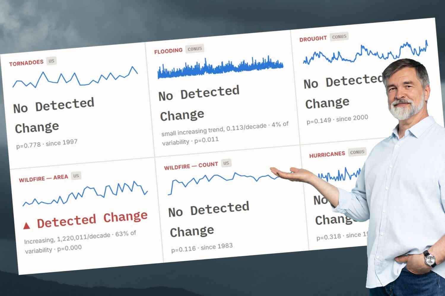
There's a tremendous amount to peruse, but I think you'll pick up on the big takeaway just by glancing at the board:
Yes, that's official government and scientific data showing "no detected change" in six out of eight major climate markers over the decades.
As you can see, only "heat waves" and "wildfires (by area)" have trended upward over recent decades. All of the other catastrophic markers we've been told will accompany climate change over the years — devastating hurricanes, increased flooding, brutal droughts — have remained statistically flat.
When you break it down, the pause in major climate variability becomes even more striking. Here, for instance, is the data on hurricanes:
No change in rainfall, no change in "rapid intensification," no change in U.S. landfall — all very good numbers!
Here, meanwhile, is about 130 years' worth of "drought severity" data:
Doesn't seem like anything to shut down the economy over!
And yet, even as we speak, elites from major institutions around the world are calling for a return to the Stone Age in order to save the planet.
Pielke, meanwhile, says the endeavor was a necessary one given the surprising lack of effort from other sources:
I am surprised that no such dashboard exists. The U.S. National Climate Assessment, with far more resources than I have available, could have created an ongoing, browsable set of extreme-weather indicators that anyone can explore. So could any number of research groups and agencies. Yet as far as I can tell, no one has.
So I built it myself.
Glad you did, Roger!
Watch our latest video 👇


Source link