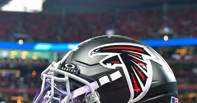
The Atlanta Falcons have revealed their new logo, and fans on social media think it resembles an older and not good look.
The team dropped the new logo, featuring a falcon set against a red background with gold, white, and black stripes.
New PFP 👀 pic.twitter.com/gBXWISJav4
— Atlanta Falcons (@AtlantaFalcons) October 21, 2026
Fans immediately began describing the logo as having an eerie resemblance to the Nazi banners used by Hitler’s Germany.
— comrade (@dahcomradee) October 22, 2026
— Stephen L. Miller (@redsteeze) October 22, 2026
Fixed it for you 😁 pic.twitter.com/wbtaCzybxB
— Richard Roughton (@richmooreiv) October 22, 2026
Pregame warmups be like... pic.twitter.com/jtbiNhxitY
— Matthew Ridenhour (@mridenhour) October 22, 2026
"End Racism," "Choose Love," "Stop Hate," and "Inspire Change"
— TBone Nation (@USFBullsTboned) October 22, 2026
Atlanta says Nein. pic.twitter.com/zXDknJb2Y6
“I must say, I was not expecting to wake up this morning to see that the Atlanta Falcons are preparing to invade Poland,” one fan wrote.
“Hail Atlanta,” another chimed in.
The logo is unlikely to change, as teams pour millions into designing and distributing these images and the products that bear them. Still, given that teams frequently focus-group new logos before release, it’s hard to imagine no one voiced concerns about the logo’s similarity to the Nazi banners of old.
Or maybe the team just disagreed with those who saw the likeness and moved forward anyway?
Either way, the Falcons have big problems. Not just because their logo, to some, looks like something out of Mein Kampf, but also because last Sunday they apparently forgot they have one of the best running backs in football, and it cost them a game.
Might want to fix that.
Source link